 SnapPress
How to Put Images Side by Side in WordPress (Gutenberg, 2026)
There are four reliable ways to display images side by side in WordPress. The right one depends on how much control you need: Gallery block for a uniform grid, Columns block for mixed content or unequal widths, custom HTML for pixel-level control, or a gallery plugin for Masonry and lightbox layouts. This guide covers all four using the Gutenberg block editor.
If your images are failing to upload before you can arrange them, see how to bulk upload images to WordPress from your phone first.
Why Images Stack Vertically by Default
In HTML, <figure> and <p> are block-level elements. When you insert two images into a WordPress post, each lands in its own block-level container and stacks top to bottom. Making them sit side by side requires putting them inside a shared flex or grid container — which is exactly what the Gallery block and Columns block do automatically.
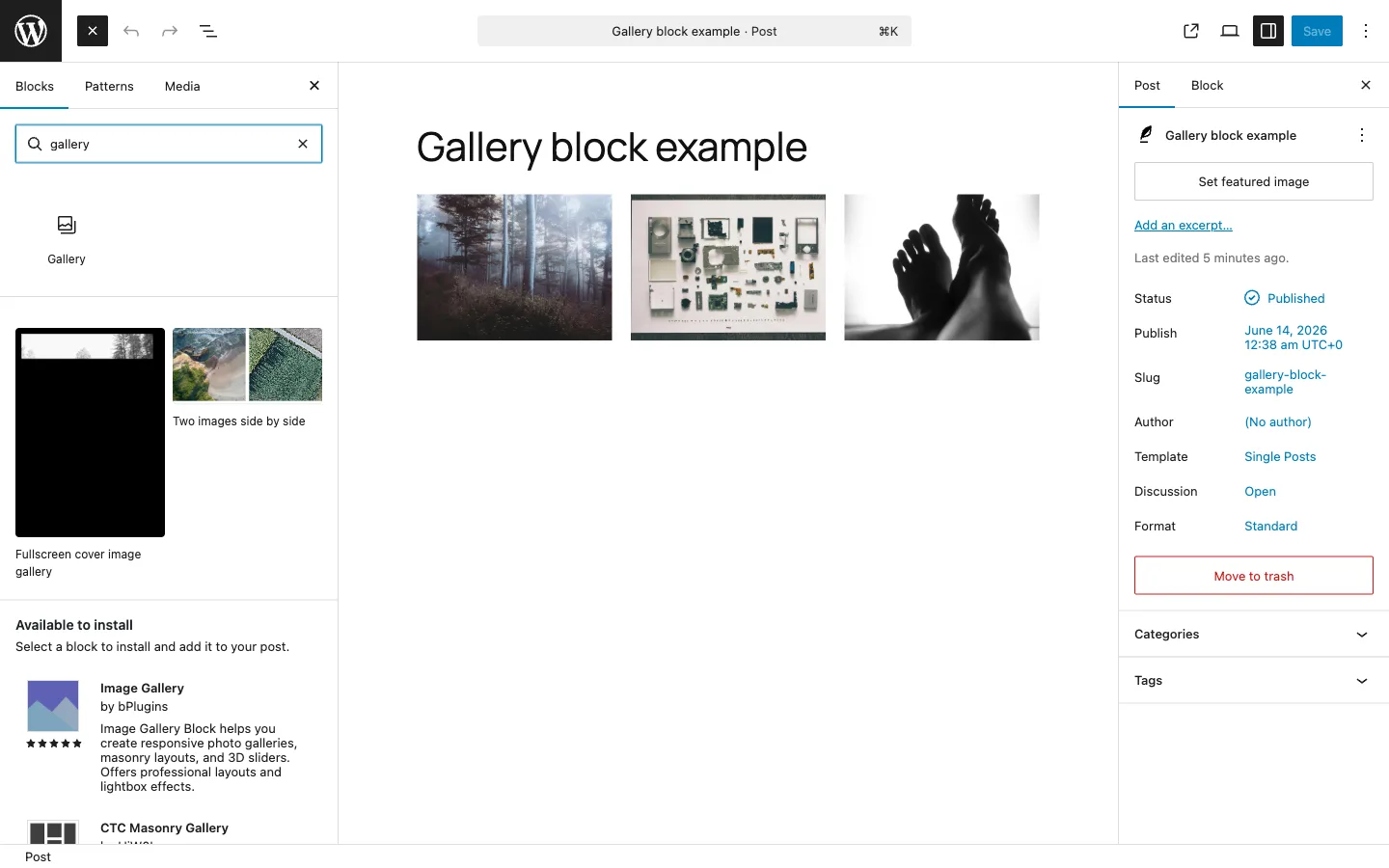
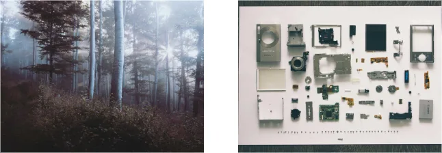
Method 1: Gallery Block (Fastest, Uniform Grid)
The Gallery block is the quickest way to put two or more images side by side. It creates an equal-width grid and handles responsive behavior automatically.

How to use it
- Click the + inserter and search for Gallery.
- Click Add to select images from your Media Library, or upload directly.
- In the block sidebar on the right, set Columns to 2, 3, or 4.
- Enable Crop images to fit if you are mixing portrait and landscape shots — this keeps the row heights uniform.
Spacing between gallery images
In the sidebar under Style, look for the Gap control. You can also override it with Additional CSS if you want a precise value:
.wp-block-gallery {
  gap: 12px;
}
When to use the Gallery block
- Showing 2–12 photos in a uniform grid
- Portfolio or event photos where equal sizing looks intentional
- When you want automatic mobile stacking without writing CSS
Limitations
- All columns are equal width — no unequal splits
- Images only — you cannot mix in text, video, or other blocks
- Maximum 8 columns
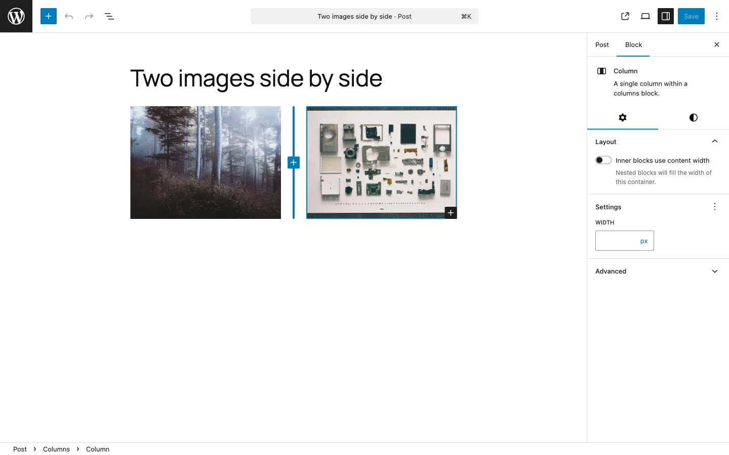
Method 2: Columns Block (Unequal Widths, Mixed Content)
The Columns block is more flexible than Gallery. Each column can contain any block — image, text, video, button — and you can set custom widths per column.
How to use it
- Click + and search for Columns.
- Choose a layout: 50 / 50 for equal halves, 67 / 33 for a two-thirds / one-third split, or 33 / 33 / 33 for three equal columns.
- Click inside each column and add an Image block.
- To adjust widths after the fact, click a column and edit its Width percentage in the sidebar.
Controlling mobile behavior
By default, columns stack vertically on screens narrower than roughly 600px. This is usually the right behavior for content. To keep columns side by side on mobile (useful for small icon rows), uncheck Stack on mobile in the Columns block settings.
When to use the Columns block
- Image on the left, text description on the right
- Before / After comparison with different sized images
- Mixed content layouts (image + video + caption)
- Any situation requiring unequal column widths
Method 3: Custom HTML with Flexbox or CSS Grid
When you need pixel-level control or want to avoid theme CSS interference, writing your own HTML is the most reliable approach. Use a Custom HTML block in the editor.
Flexbox: two or three images side by side
<div style="display: flex; gap: 16px; flex-wrap: wrap;">
  <img src="/wp-content/uploads/2026/06/photo-1.jpg" alt="Description 1" style="width: calc(50% - 8px); height: auto;" />
  <img src="/wp-content/uploads/2026/06/photo-2.jpg" alt="Description 2" style="width: calc(50% - 8px); height: auto;" />
</div>
For three columns, change 50% to 33.33% and adjust the gap math accordingly.
CSS Grid: consistent spacing without gap math
<div style="display: grid; grid-template-columns: repeat(3, 1fr); gap: 16px;">
  <img src="/wp-content/uploads/2026/06/a.jpg" alt="A" style="width: 100%; height: auto;" />
  <img src="/wp-content/uploads/2026/06/b.jpg" alt="B" style="width: 100%; height: auto;" />
  <img src="/wp-content/uploads/2026/06/c.jpg" alt="C" style="width: 100%; height: auto;" />
</div>
Grid is cleaner when you have many images: change repeat(3, 1fr) to repeat(4, 1fr) and all the spacing adjusts automatically.
Making it responsive
Inline styles cannot use media queries. Put the responsive rules in Appearance → Customize → Additional CSS instead:
.image-row {
  display: flex;
  gap: 16px;
  flex-wrap: wrap;
}
.image-row img {
  width: calc(33.33% - 11px);
  height: auto;
}
@media (max-width: 768px) {
  .image-row img {
    width: calc(50% - 8px);
  }
}
@media (max-width: 480px) {
  .image-row img {
    width: 100%;
  }
}
Then add the class to your div: <div class="image-row">.
Gotcha: WordPress may strip style attributes
Some security plugins and WordPress configurations strip style attributes from HTML in the editor. If your inline styles disappear after saving, put all CSS in Additional CSS with class names, and use only class attributes in the HTML block.
Method 4: Gallery Plugins (Masonry, Lightbox, Large Collections)
Standard blocks cover most cases. Reach for a plugin when you need Masonry layouts, hover effects, lightbox popups, or galleries with hundreds of images.
| Plugin | Best for | Price |
|---|---|---|
| Modula | Masonry, custom grid, hover effects | Free / from $39/yr |
| FooGallery | SEO-optimized, fast loading | Free / from $59/yr |
| Photo Gallery by 10Web | Large collections (100+ images) | Free / from $60/yr |
| NextGEN Gallery | Photographer workflows, EXIF display | Free / from $79/yr |
If you only need a simple side-by-side layout, the standard Gallery block is enough and avoids the plugin overhead and compatibility risk.
Responsive Behavior Summary
| Method | Mobile behavior | Controllable? |
|---|---|---|
| Gallery block | Auto-stacks at mobile breakpoint (theme-defined) | Partially (column count setting) |
| Columns block | Stacks at ~600px by default | Yes (Stack on mobile toggle) |
| Custom HTML / CSS | Whatever you write in media queries | Full control |
| Gallery plugin | Plugin-dependent, usually well-handled | Plugin settings |
Common Problems and Fixes
Images are still stacking vertically after using Gallery block
Check your theme's CSS. Open DevTools (F12), inspect the gallery container, and look for display: block applied to .wp-block-gallery. If a theme rule is overriding the flex display, add this to Additional CSS:
.wp-block-gallery {
  display: flex !important;
  flex-wrap: wrap;
}
Also confirm you are using the modern Gallery block, not a Classic block containing an old-style gallery shortcode.
Heights are uneven between images in the same row
Portrait and landscape images mixed in the same row will produce uneven heights unless you crop them. In the Gallery block sidebar, enable Crop images to fit. Alternatively, upload images pre-cropped to the same aspect ratio before adding them to the gallery.
Gap between images is too large or too small
For the Gallery block, use the Style → Gap control in the sidebar. If the control is not visible, add to Additional CSS:
.wp-block-gallery {
  gap: 8px;
}
Images shrink too much when placed side by side
This happens when you have three or four columns with images that were uploaded at a low resolution. Each column gets a fraction of the content width — at three columns inside a 720px content area, each image is roughly 230px wide. Make sure your source images are at least 1200px wide so they have resolution to spare after the layout shrinks them.
Getting Images Into WordPress Efficiently
Side-by-side layouts work best when images have consistent sizing before they hit WordPress. If you shoot on iPhone and then resize each image individually before uploading, the process becomes a bottleneck.
SnapPress is an iPhone app that uploads photos directly to your WordPress Media Library. For gallery workflows it helps in two specific ways: you can select up to 20 photos at once and batch upload them at a consistent target width, and it converts HEIC to JPEG automatically so every image arrives in a format WordPress can thumbnail correctly.
Once the images are in your Media Library at the right size, inserting them into a Gallery block or Columns block takes seconds.
For sizing guidance on specific image types, see WordPress featured image sizes. For troubleshooting when image dimensions are not applying correctly, see WordPress image size not changing: causes and fixes.
Frequently Asked Questions
Why are my WordPress images not showing side by side?
The most common reason is that each image is inside its own full-width block element (figure or p), which stacks vertically by default. Use the Gallery block or Columns block to put images in a shared flex container. If you are already using Gallery and images are still stacking, check whether your theme's CSS is applying display: block to .wp-block-gallery, overriding the flex layout.
How do I put two images side by side in the WordPress block editor?
The fastest way: insert a Columns block (plus icon → Columns), choose a 50/50 layout, then add an Image block inside each column. For a gallery-style grid, use the Gallery block instead and set the column count to 2 or 3 in the block sidebar.
Will images stay side by side on mobile?
Columns blocks stack vertically on mobile by default (at around 600px viewport width). You can uncheck Stack on mobile in the block settings to keep them side by side on small screens. For most content, letting them stack on mobile is the better user experience.
How do I add space between images placed side by side?
In the Gallery block, the gap between images is controlled by the Gap setting in the block sidebar under Style. For Columns blocks, use the Column gap setting. For custom HTML, use gap: 16px on the flex or grid container.
Can I show images side by side with different widths?
Yes. Use a Columns block and set each column to a custom percentage in the sidebar (e.g. 67% and 33% for a two-thirds / one-third split). The Gallery block only supports equal-width columns.
Need to upload a batch of photos before building a gallery?
SnapPress uploads up to 20 iPhone photos at once directly to your WordPress Media Library. QR code setup, automatic HEIC conversion, consistent sizing across the batch. Free to start.
Get SnapPress